A user-friendly website
The best website is a user-friendly website. If a website is not easy to use, a lot of visitors leave for another website that is easier to use. And what is your website about? Are your texts understandable for your target group?
A user-friendly website
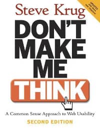 The American Steve Krug analysed the user-friendliness of websites and wrote the book "Don't make me think" about it. He had people do user-friendly tests and watched how they tried to do them on the website. In his book he describes what a good website is all about: clear navigation, following standard website conventions and limiting choices.
Clear navigation
Use a clear menu structure that makes sense for someone who is first on the website. Make your menu on the left predictable. Do not open PDF documents, new windows or new websites from the menu. It is clearer when a menu link opens a page from your own website. And on that page you then show a short description with the link to the PDF documents/new window/external website.
Use a breadcrumb trail. Many visitors who come to a website via a search engine do not enter the homepage. They often arrive on a deeper page. With the breadcrumb trail you make it clear to them where they are in the structure of your website.
Use a sitemap. A sitemap is useful for search engines and your visitors. For search engines, an XML sitemap is a handy overview of which pages need to be indexed (useful for search engine optimisation). And visitors can quickly scan your site for information via your sitemap.
Follow website conventions
Most websites have:
- On the top left a logo that you can click to go to the homepage
- At the top a menu with submenu items underneath
- At the bottom standard links to a privacy statement, sitemap, general terms and conditions
- Clear hyperlinks in the text that are colour-coded and underlined; also useful for accessibility.
- A "hover effect" when you move the mouse pointer over hyperlinks or buttons. This makes it clear that the element is clickable.
Limiting choices
The more choices a visitor has, the more difficult it is to choose. Two American psychologists described in the article "When choice is demotivating: Can one desire too much of a good thing?" the effect of offering fewer choices on consumers' purchasing decisions. In an experiment, a supermarket, which first offered 24 different flavours of jam, saw a considerable increase in turnover when it reduced the offer to 6 choices. The participants in the study were more satisfied with these 6 choices and gave better reviews.
Make sure your visitors navigate easily through your website and limit the choices.
Be clear and consistent
 Make the content pleasant and easy to read. Visitors have little time. They don't read but scan pages for information. A good book for writing, editing and creating content for the digital world is "The Yahoo! Style Guide".
Some tips about the content:
- Divide the content of the website into clear pieces
- Use descriptive headings
- Avoid long stretches of text but use paragraphs with white lines
- Use enumeration lists to share information point-by-point
Easy to maintain
A user-friendly website is important for your visitors because it allows them to use the website in the most comfortable way. This is useful for you because it enables you to achieve your goals better.
But also think of your administrators! Make sure your website is easy to maintain! The more comfortable the administrators can work with a website, the more up-to-date they can keep the content up to date (and the more reliable your website comes across).